Trying out the developer preview of macOS Tahoe gave me thoughts I wanted to post. This is a short post, if you want me to do a more in-depth post let me know and I’ll do a proper review when the OS ships.
My first impression is decidedly unimpressed. I think I need to start with Liquid Glass.
Liquid Glass
I like skeuomorphism, and as a result I think Liquid Glass looks pretty nice in some places. On the other hand, it also seems to make the interface functionally worse, everywhere.
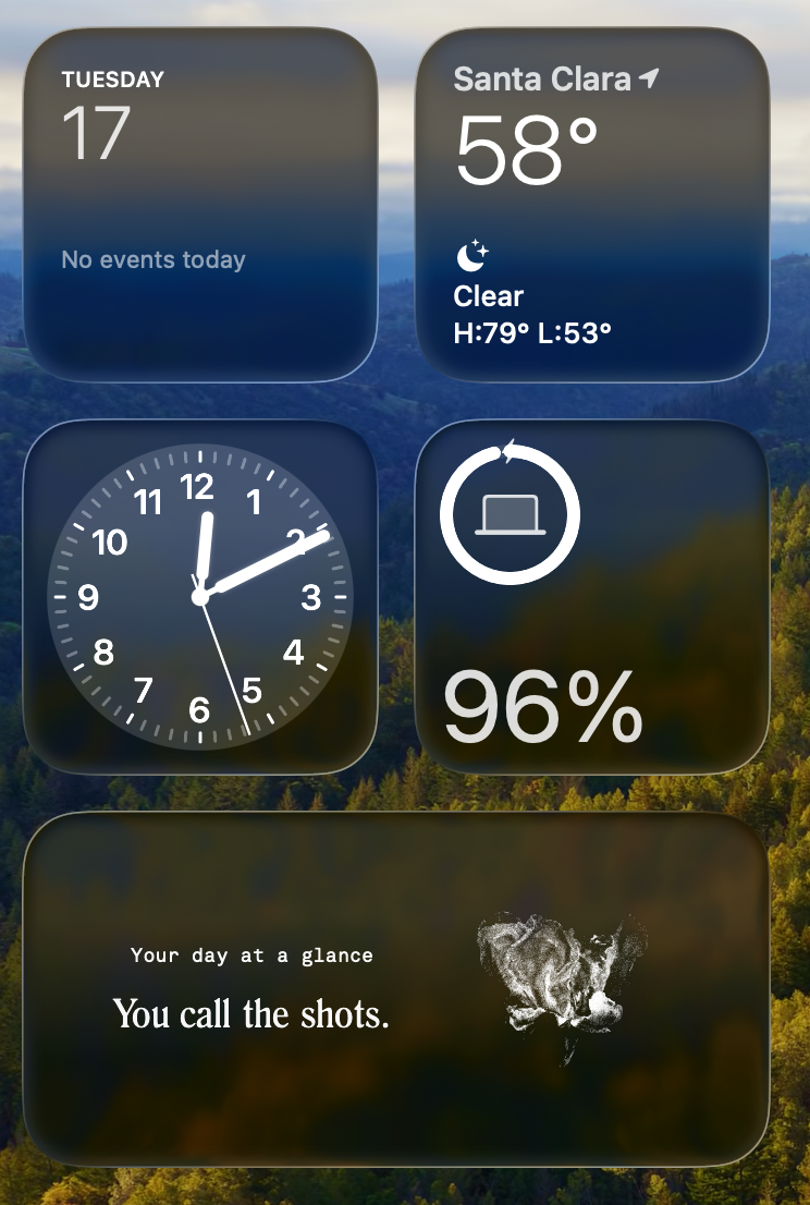
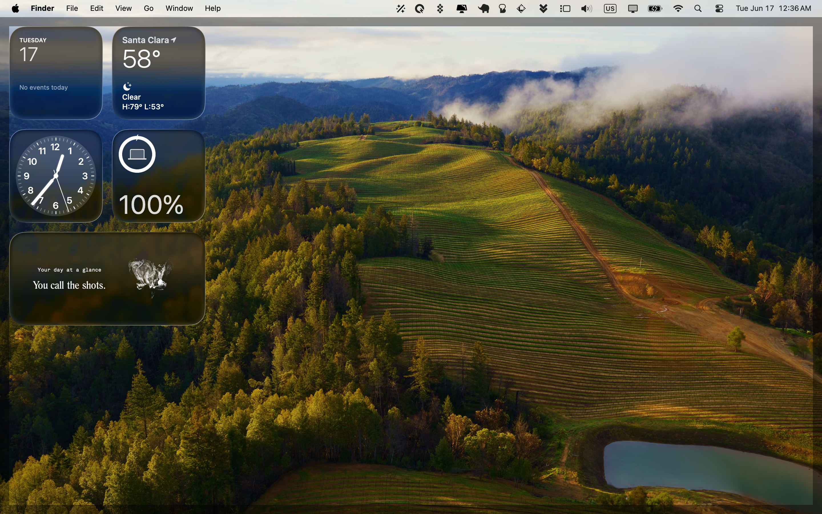
Let’s start with some positives. The Dock with clear icons can look pretty slick. A nice set of desktop widgets can also look really nice.
Dragging sliders on brightness and volume is also slick.
Here come the problems, which are largely the same as the ones on iOS. I’ll focus on my own personal nitpicks. First off is readability.
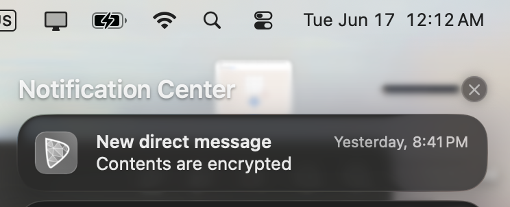
Do you find that readable? Neither do I. Transparency doesn’t add anything to the UI for Notification Center, it just makes it feel less usable.
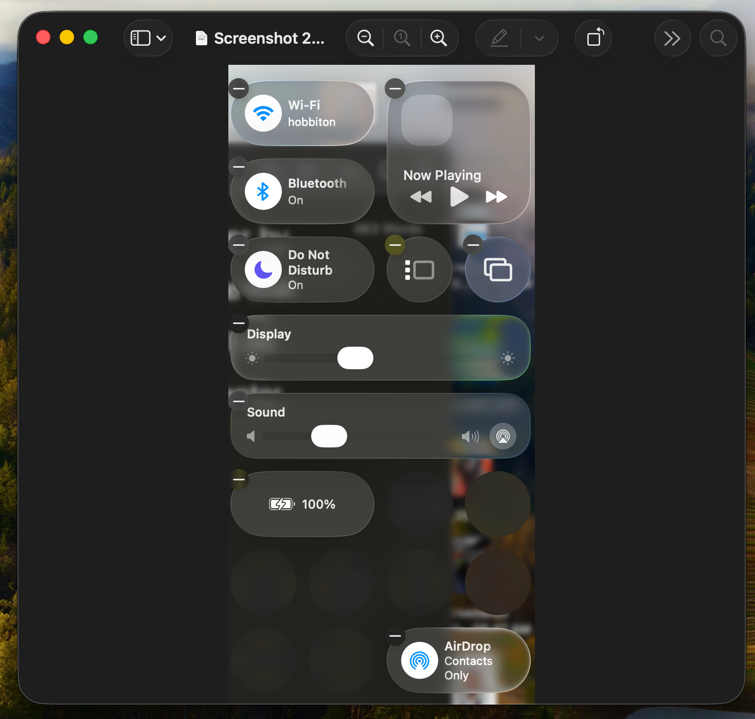
Control Center suffers similarly and just feels worse in general. I don’t like having to guess where it begins and ends! This is actually worse on desktop than iOS.
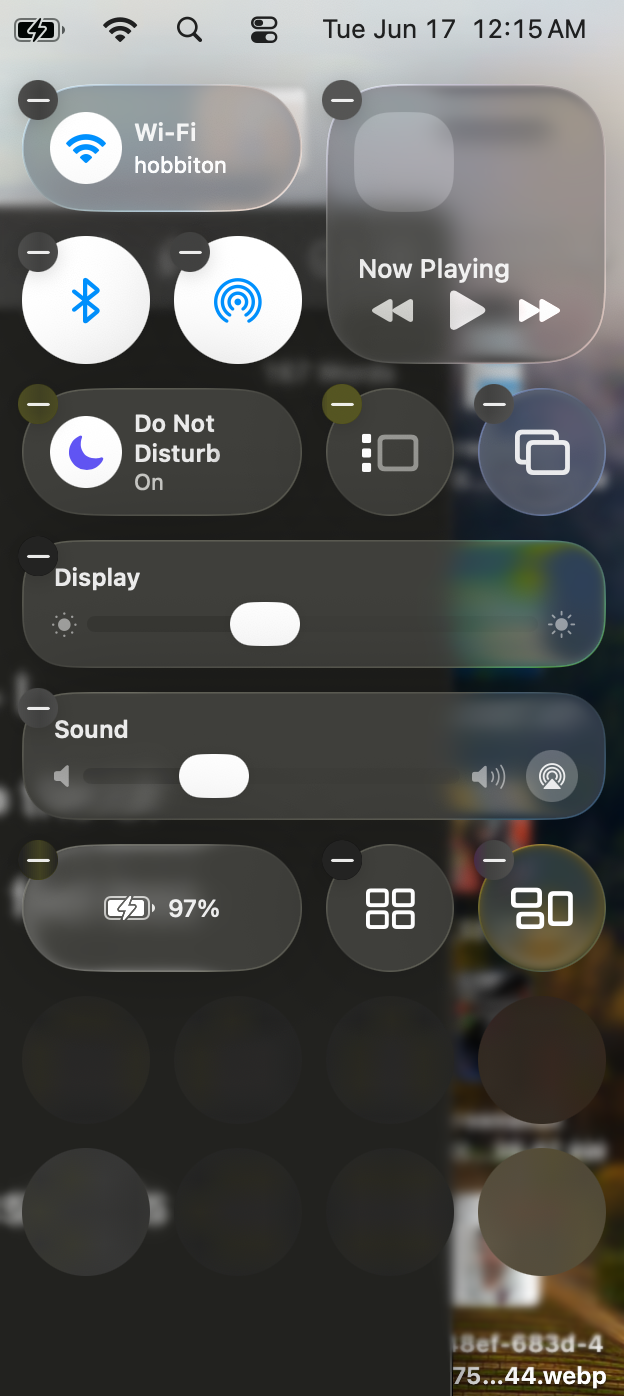
Also, elements that can expand should be expanded in place, so going back is easy. Navigating the Control Center has always been confusing and doesn’t get any better in Tahoe.
Perhaps the most confounding thing about Control Center in Tahoe is customization. For starters, several tiles behave completely differently in “small” mode vs any larger size. Why are Bluetooth and AirDrop only toggles in small mode, but expandable into a useful menu from any other mode? There’s no good reason for this and it only serves to make the experience worse. This gets worse when you consider that it’s not even a consistent behavior. Both the Display and Sound tiles behave like they should in small mode; that is, expandable.
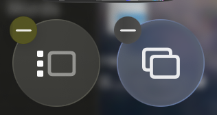
Control Center’s editing UI is basically unusable, too. It’s all well and fine to show me a gallery of tiles I can add with previews and a name shown next to them; but how good is any of that if I can’t even see the name of the tiles I already have? I mean this - as far as I can tell, there is no way to see what the heck the tiles you already have in the Control Center actually are. With ambiguous icons like these, this becomes genuinely troublesome. These icons are both in the Control Center by default and I have a strong feeling most users will not know what they do just by looking at them. The first one is for Stage Manager, by the way, a more-or-less useless feature that has no reason to exist on the Mac at all, let alone be a default tile in the Control Center.
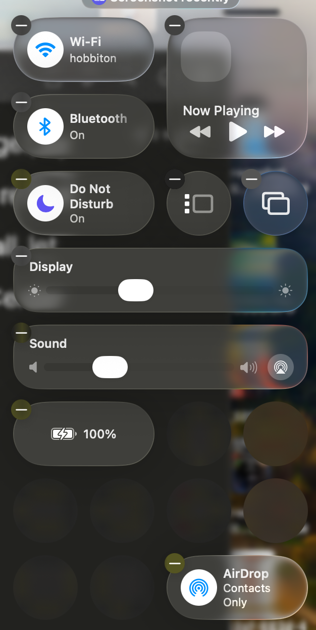
Finally, the editor lets me create the following arrangement, and saving it works and leaves that tile floating there with a bunch of transparent but nonfunctional clear space in between. It’s pretty bad. The transparency is so bad Control Center as a whole no longer looks like a distinct UI element, despite the fact that it is one. At the very least, when editing it, I should simply not be allowed to create the arrangement below.
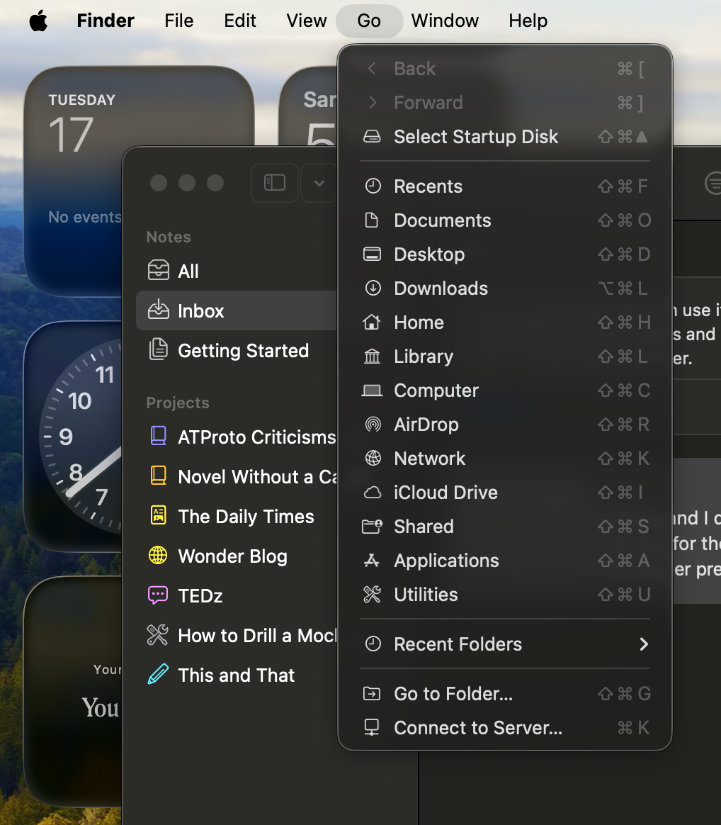
Another UI element that is significantly more confusing are sidebars. Here is a Finder window in Tahoe:
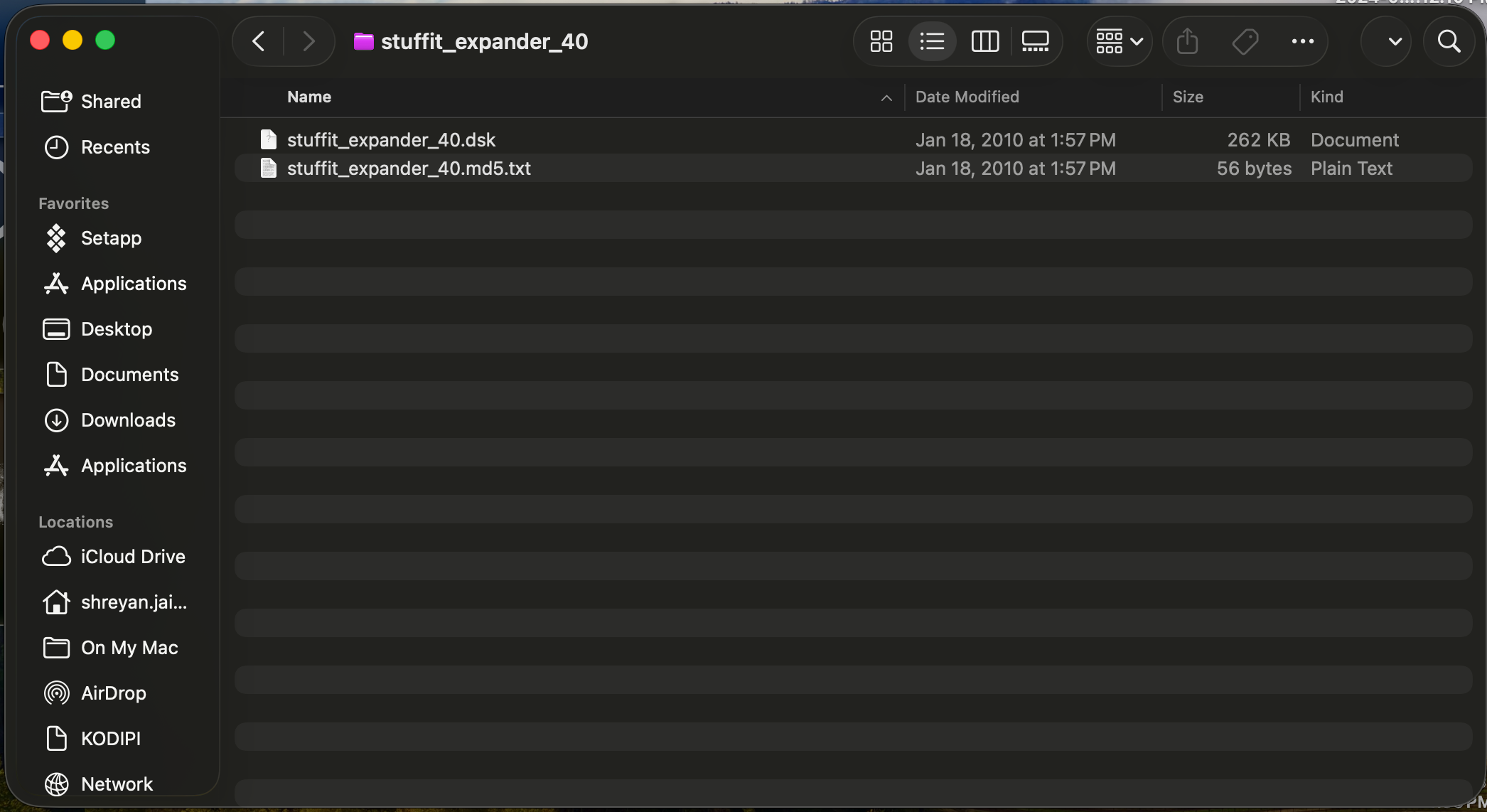
The sidebar looks like it is floating above some other content within the window. It is not. Can someone tell me why it looks like it does?
Compare this to how you probably expect a sidebar to look:
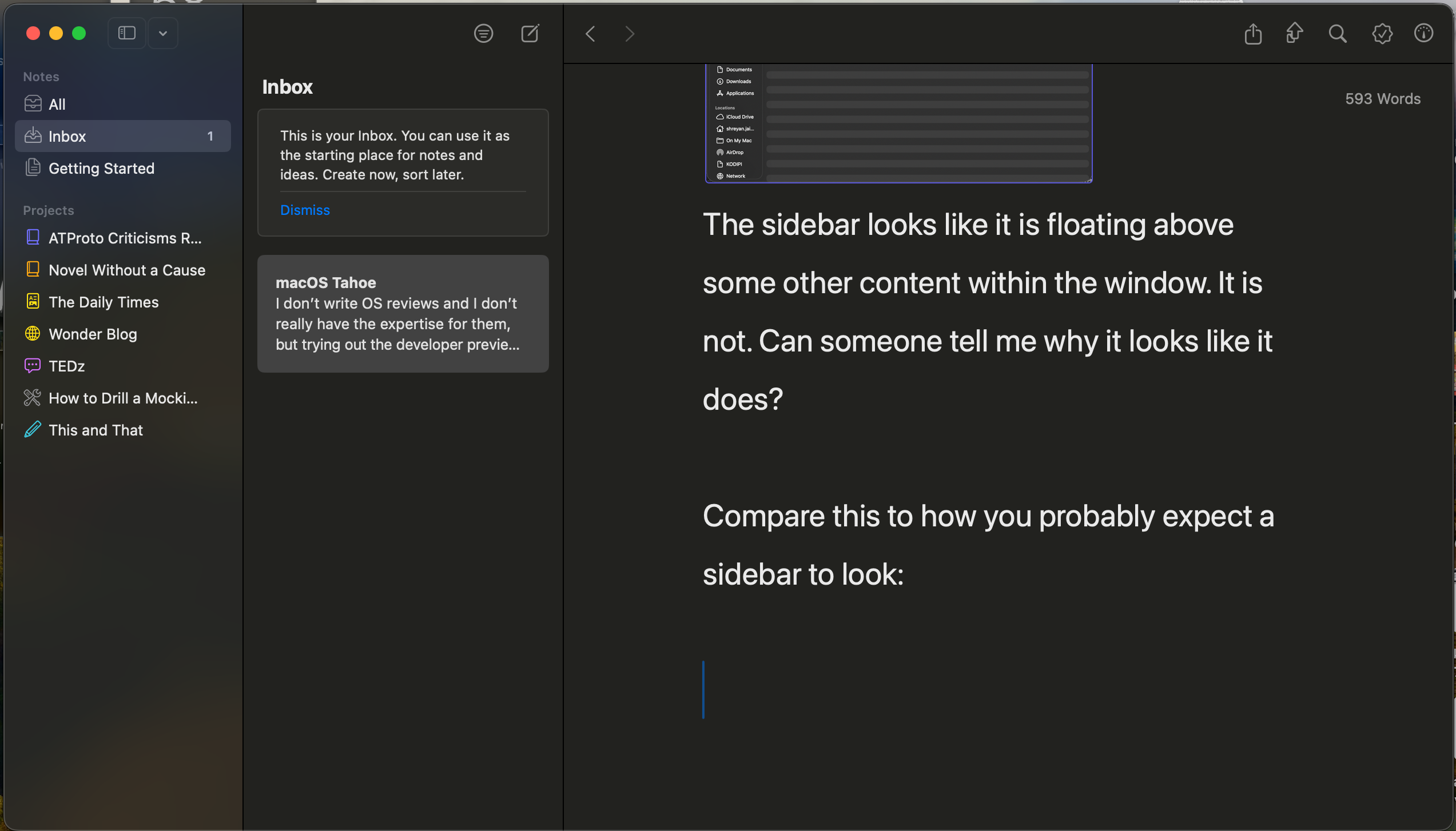
This sidebar does not appear to be floating on top of any other content within the window and does not confuse you. I think this is a pretty glaring mistake in Liquid Glass.
The transparent menu bar is another mistake. For starters, it makes the “Show Desktop” function look really strange:
Something doesn’t just look right. I think just giving the menu bar some cleaner visual separation from the desktop would fix that. But it gets uglier when actually trying to use the menubar itself:
I don’t know about you, but that pill menu selection indicator is not doing it for me.
The new look inside applications, at least on macOS, also seems completely disconnected from the rest of the Liquid Glass design. Take a look at the Preview application:
Do those widgets look glassy to you? No, they just look… weird. Combined with the crazy amount of rounding on the window (which, by the way, is impossible to predict for any application you open; some have it, some don’t), Mac apps look like Gnome apps now. As a Gnome disliker, I am not pleased.
Actually, speaking of the window corners:
I want to like the look of Liquid Glass, but actually using it is a marked downgrade from the user interface in Sequoia and past macOS versions. As a UI overhaul, it’s not very big and definitely not nearly as big as Apple claims. The overhauls from Mavericks to Yosemite or even Tiger to Leopard were far larger and much more visually striking. The only time you’ll notice Liquid Glass is when you’re irritated at being unable to read a newly translucent UI element.
Spotlight
…you’re gonna wanna stick to Raycast. Annoyingly, keyboard navigation of the new UI isn’t really intuitive.
I’m pretty annoyed by the removal of Launchpad in favor of a new Applications category in Spotlight. It’s a pointless change which is actually a step down from Launchpad. Until macOS Tahoe, I didn’t realize how much I actually used the Launchpad. Apparently, this whole time, when opening applications, my muscle memory has been bottom-left-hot-corner -> move mouse to app icon -> click. I did not know this was how I did things until it disappeared, which honestly shows it was good UI that got out of the way. Seriously, spatial memory works. The Spotlight UI just doesn’t have that speed or convenience (even the quick apps that show up change order based on recency of usage and you can’t make folders). Without Launchpad, there’s no longer even a way to browse all the applications installed on your computer.
The Actions search using Apple Shortcuts isn’t very powerful or very useful yet. I really am struggling to find a way to make it useful to things I do at all. Raycast is still the way to go for now. Most of the software I use doesn’t actually use App Intents in meaningful ways.
Clipboard history being a part of Spotlight is honestly pretty annoying. It should have been implemented as a standalone feature. As of right now, the easiest way to access clipboard history is ⌘+Space+4. This isn’t a very obvious keyboard shortcut, in my opinion. Something like ⌘+⌥+V would’ve made more sense to me.
Other
I’m going to try Apple Intelligence in Shortcuts at some point. Sounds neat, and I could potentially imagine using it.
Most of the other updates in Tahoe are related to Continuity. Since I don’t have an iPhone, I can’t really do much with these updates, but I’m sure they’re cool.
I think the most interesting new feature will be the new Foundation Models framework accessible to developers in macOS 26. If you haven’t heard, this will basically allow app developers to access the on-device LLM that Apple says is “at the core of Apple Intelligence”.
This is an extremely obvious thing for Apple to do and probably represents the future of where generative AI is going. LLMs are now a service provided by the OS, along with the various existing AI APIs accessible to macOS and iOS developers. This is pretty sensible, and I think deserves its own longer blog post… eventually. I’m bad about these. It’ll be very interesting to see how this new API trickles up through Mac apps.
Those are my thoughts for now. I think I might write a wider post about WWDC eventually, but I’m really not very plugged into the Apple world at all, so my thoughts are unlikely to add much context beyond what you already know. If you want me to make that post, let me know.